BEAUTY · BRANDING
Beauty beyond the surface.
Reimagining altBeauty as a holistic skincare brand through a unified identity system spanning logo, packaging, photography, and digital storytelling.
01 Overview
Beauty is not a surface. It is a state of being.
altBeauty was founded on the belief that beauty is not just what appears on the surface, but a reflection of inner balance, care, and wellbeing. The brand needed a visual identity that could balance two worlds at once, the credibility of dermatology-backed skincare and the warmth of a modern wellness brand.
We built a cohesive brand system across logo, packaging, photography, and digital touch points to express that philosophy consistently. From restrained typography and soft gradients to a calm, editorial visual language, every element was designed to make the brand feel clinical without feeling cold, and premium without feeling distant.
02 The Problem
A great philosophy was stuck behind noise.
altBeauty had clarity of vision but three friction points were silently stalling growth, each one a place where the brand was leaking value, trust, or conversions. India’s skincare space is saturated with look-alike brands and repetitive promises, making it difficult for altBeauty’s holistic, dermatologist-backed philosophy to stand apart. At the same time, the wellness platform and skincare line felt disconnected, while generic packaging and a dated website failed to convert attention into trust and purchase.
03 Identity
A visual language built on balance.
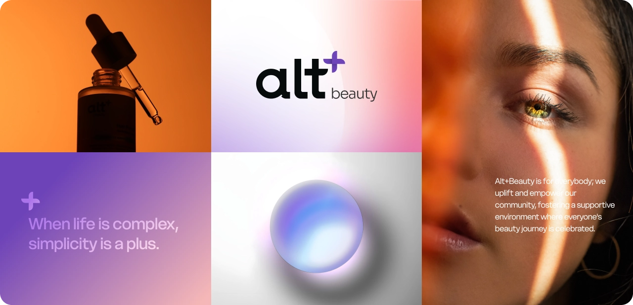
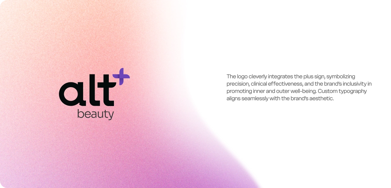
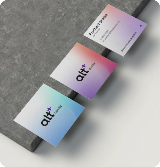
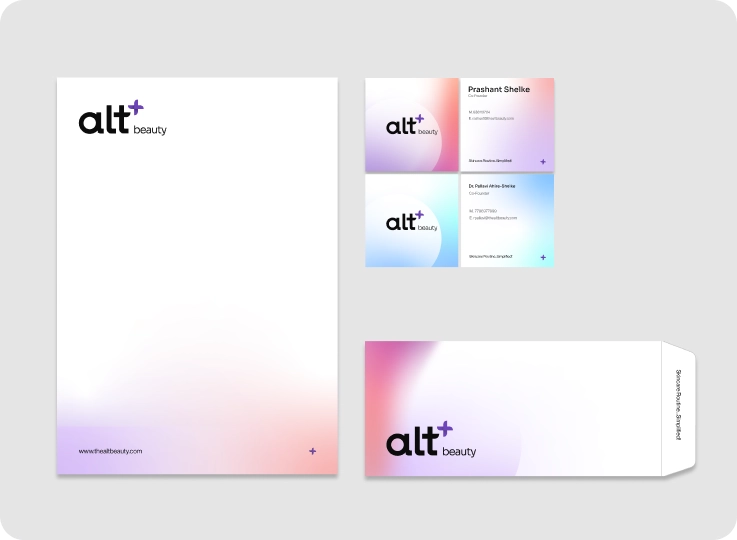
altBeauty needed an identity that could balance two contrasting worlds, clinical credibility and emotional warmth. The system was designed to feel minimal yet expressive, premium yet approachable, across every brand touchpoint. A restrained wordmark, soft gradients, and muted tones helped altBeauty balance clinical credibility with emotional warmth. The modular identity system was designed to scale seamlessly across packaging, photography, digital, and social touchpoints, while visually reflecting the brand philosophy of inner and outer beauty in harmony.
04 Packaging
Shelf recognition through restraint.
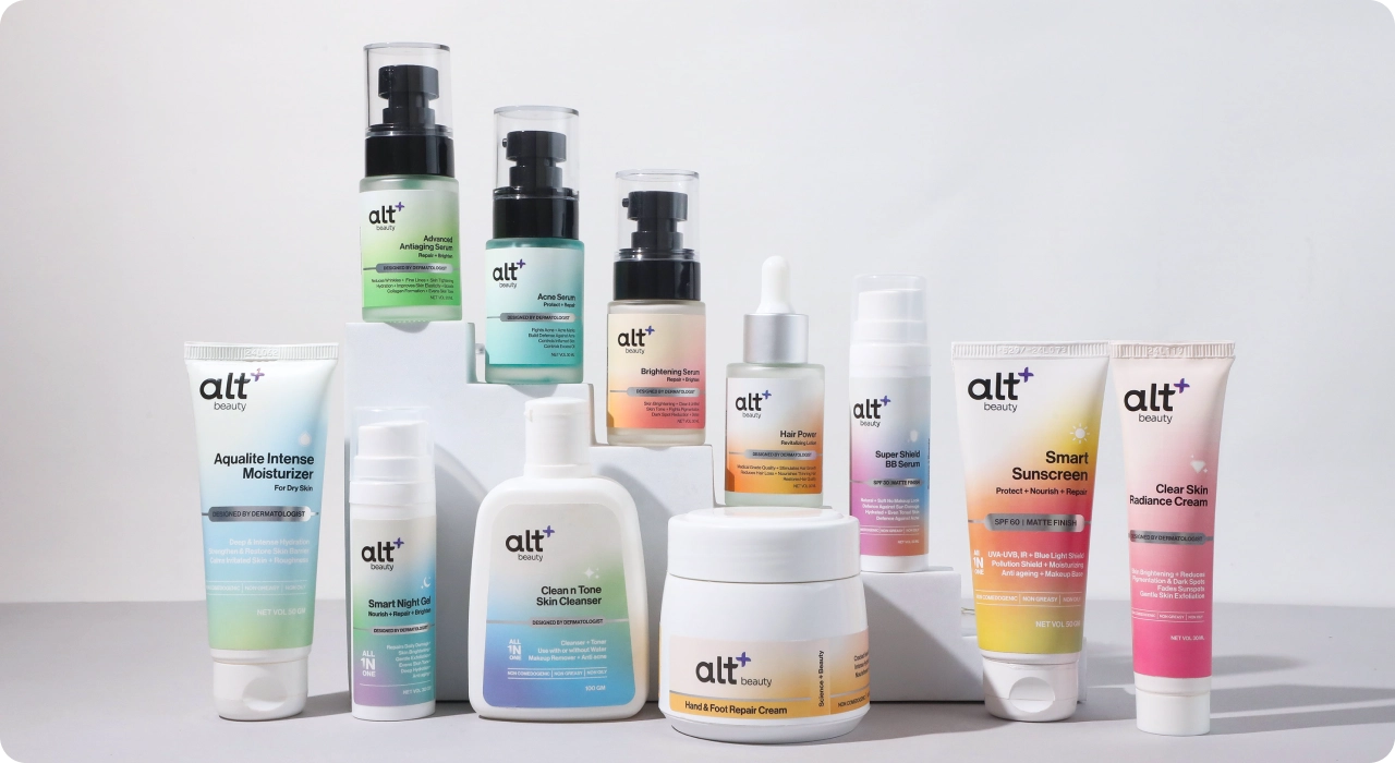
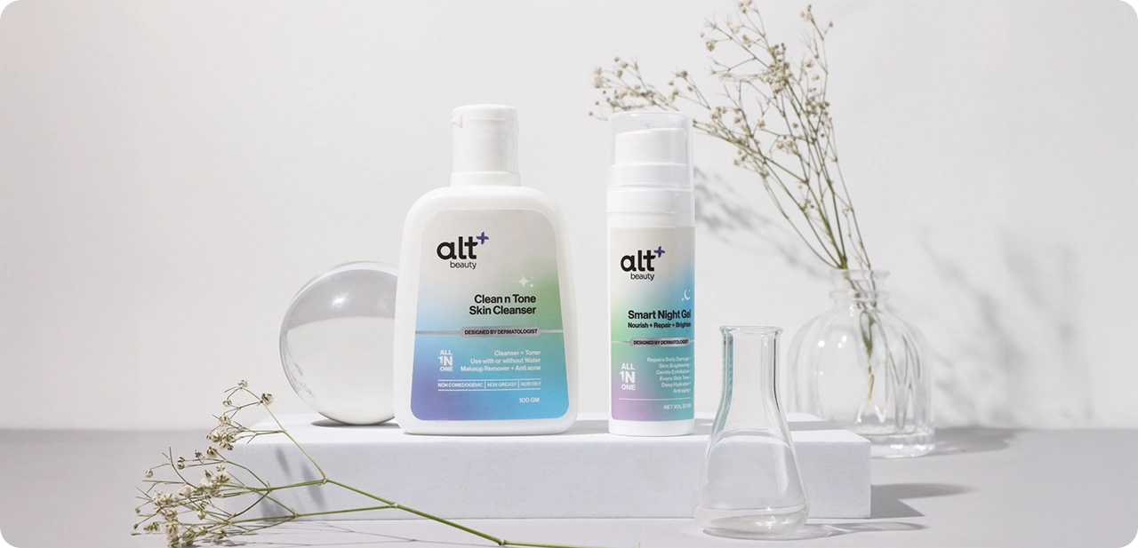
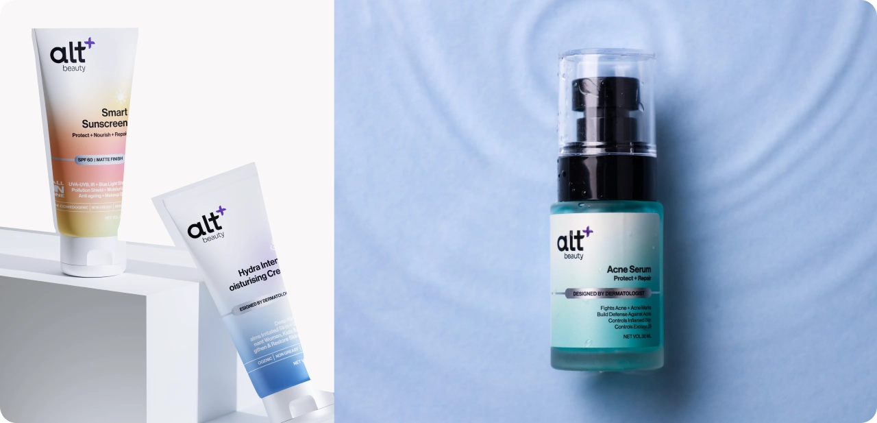
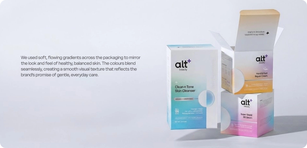
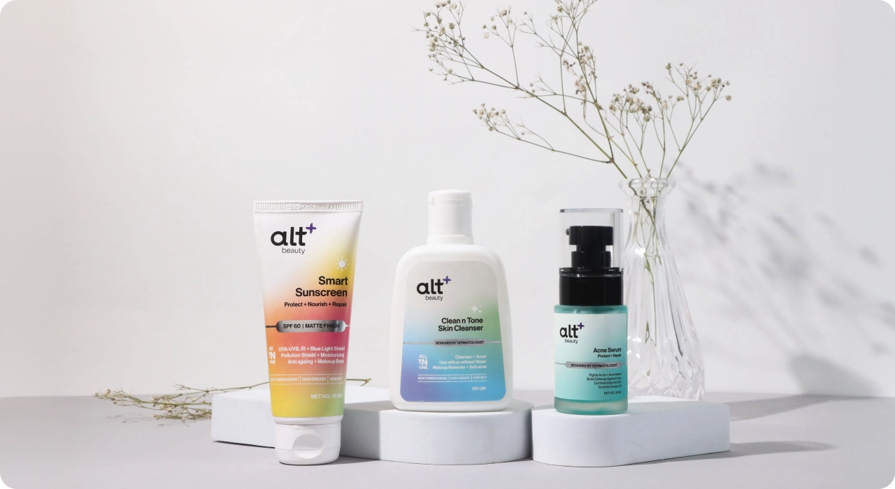
The packaging system was designed to stand apart in an overcrowded skincare category through consistency, softness, and recognisable structure, creating distinction without visual noise. A unified packaging silhouette across the SKU range made altBeauty instantly recognisable across shelves and digital storefronts. Soft flowing gradients became a key visual signature, creating warmth, recall, and category distinction, while the system later earned recognition at the AFAQs Foxglove Awards for packaging design excellence.
05 E-commerce Experience
One brand. One connected journey.
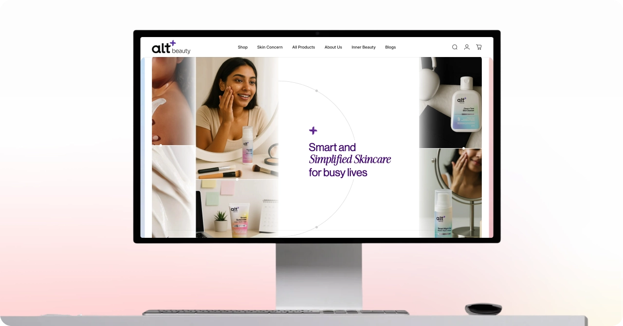
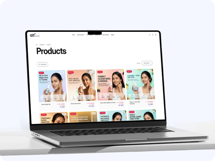
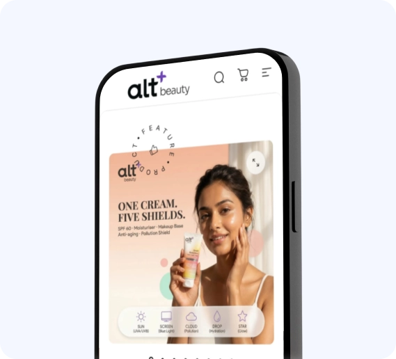
An Inner World content platform on WordPress seamlessly integrated with the altBeauty product store on Shopify, creating one connected experience across content, community, and commerce.
06 Impact
Numbers that followed the vision.
Design decisions that extended beyond aesthetics shaping recognition, engagement, and brand recall across packaging, content, and commerce.
+148%
Average session duration post relaunch.
3.2x
Growth in product-page-to-cart conversion rate post-redesign.
+62%
Organic traffic growth through Inner World content.
4/4
Hero SKUs sold out within launch quarter.
1
AFAQs Foxglove Award, Packaging Design, Industry recognition for craft & storytelling.
142+
Founding community members across wellness forums.