Fintech Experience Design · Pension Platform
Fast-tracking eNPS subscriber onboarding
Re-architecting the eNPS individual-subscriber journey from a 50-screen waterfall into a faster, decision-first onboarding experience with 4 branched paths designed for clarity across desktop and mobile.
01 Overview
Simplifying pension onboarding through decision-first UX
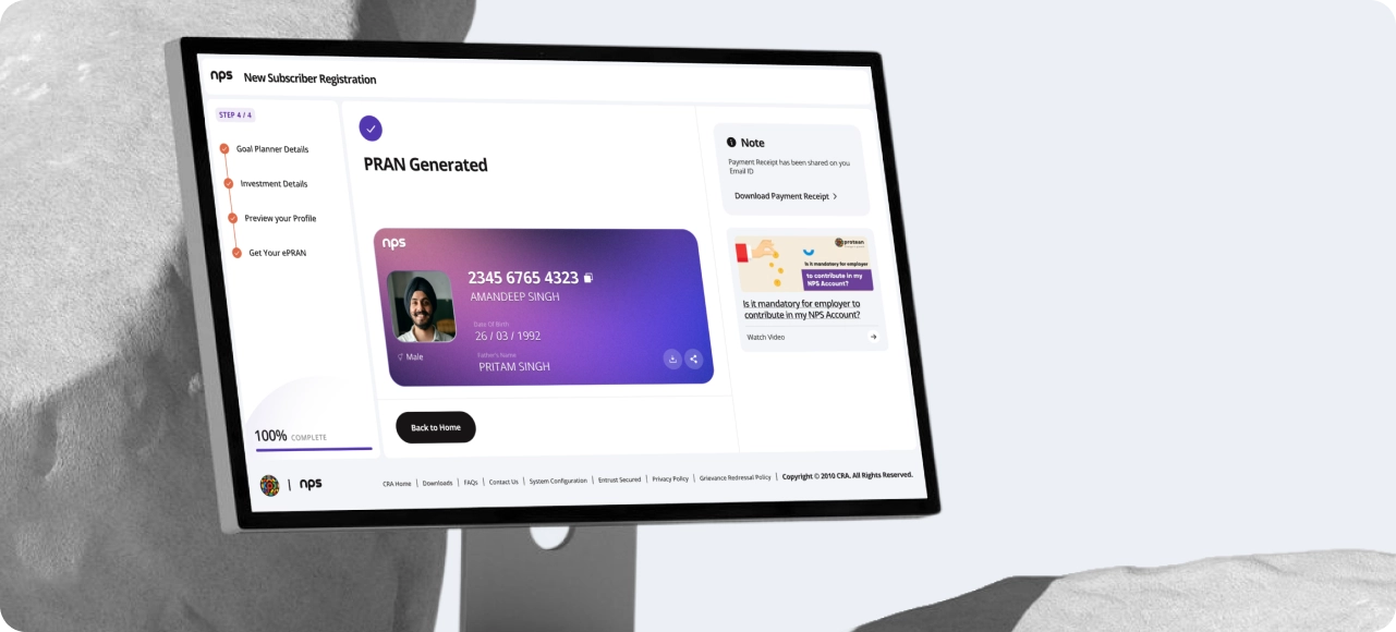
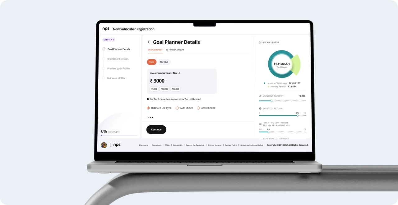
The eNPS onboarding journey helped users register, complete KYC, generate a PRAN, and make their first contribution — but the experience had become long, linear, and difficult to navigate. We redesigned the flow from a 50-screen waterfall into a faster, decision-first onboarding experience with parallel KYC and contribution paths across desktop and mobile. The result was a clearer, more intuitive journey built to reduce friction without compromising compliance.

02 The Challenge
"The journey collected every required field in order. It didn’t help users complete onboarding faster."
The legacy onboarding experience prioritised sequence over usability.
Every subscriber, regardless of familiarity, contribution intent, or preferred KYC method, was pushed through the same linear flow.
The onboarding technically worked. But the experience created fatigue long before contribution.
03 Before
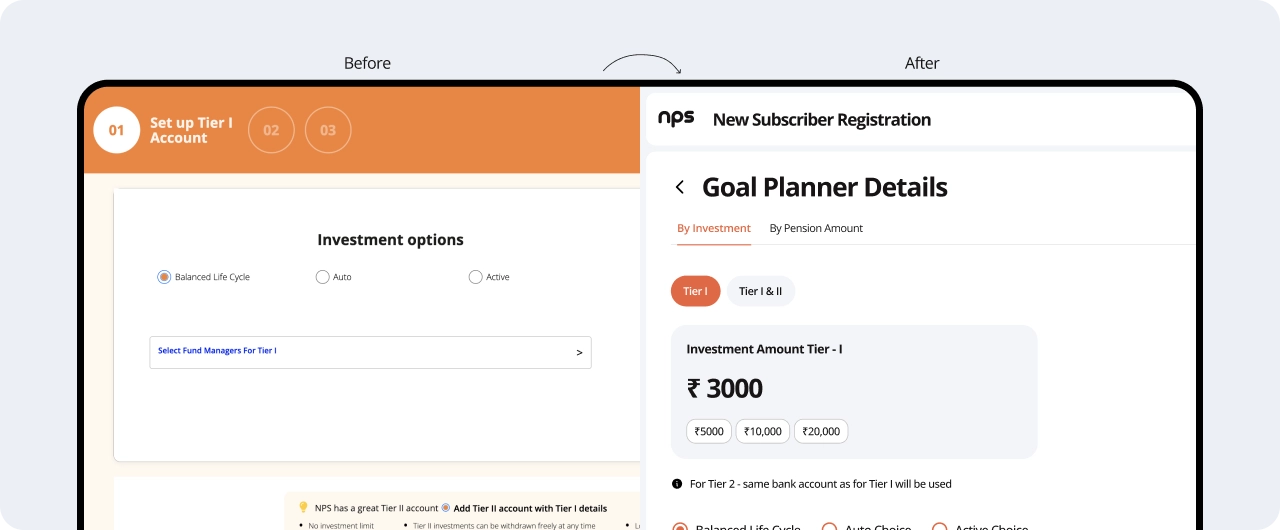
50 screens. One path.
Every user, regardless of intent, walked the same forced sequence. KYC mode and contributionmode were buried inside the funnel. There was no fast lane
What went wrong
One path for every user. No personalisation, no shortcut.
Mode selection appeared after fields were already filled. Compounded drop-off.
Failed verification looped users back to step one. The flow forgot what it knew.
Single-path waterfall · ≈50 screens including sub-steps · branches buried inside
04 After
4 branched paths. Built for velocity.
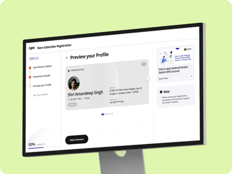
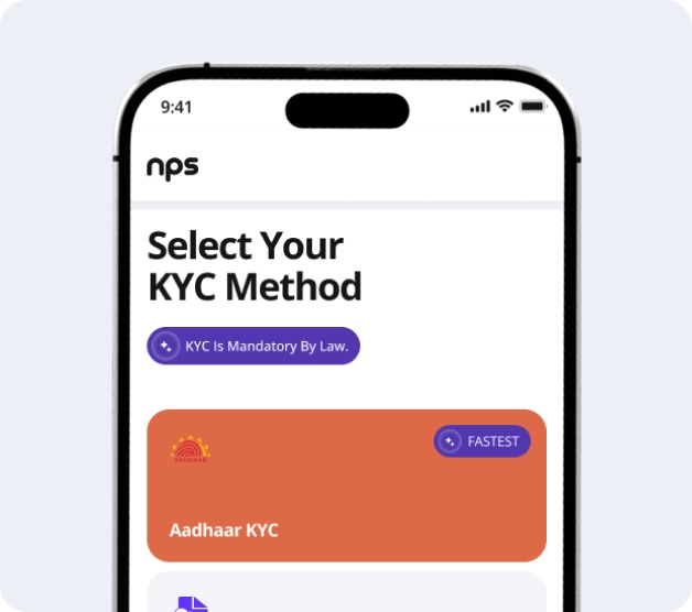
The redesign treats mode selection as the first decision. The user picks a KYC mode (Aadhaar OTP orDigiLocker) and a contribution mode (SIP, One-time, By Investment, By Pension Amount) at the top ofthe journey. Each branch then runs a short, self-contained flow that converges at PRAN generation.
What we changed
User picks KYC mode and contribution mode upfront. The architecture rewards intent.
Aadhaar OTP and Digi Locker run side by side. SIP, onetime, by investment, by pension amount each ride own short funnel.
Post-onboarding 'Edit Investment' is now a top-level branch, recognizing allocation as ongoing, not one-off.
Generated
Branched tree · ≈25 screens on the happy path · two parallel KYC modes · four parallel contribution modes

05 Measure Projected
Half the screens. Most of the friction gone
What changed for the user
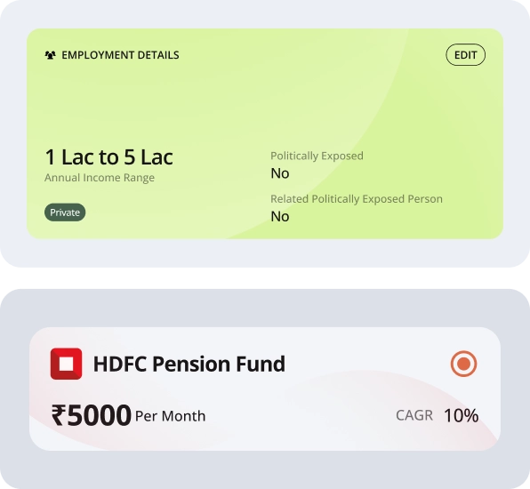
From 'fill every field in order' to 'pick a path, finish a branch'. Less mental load. Fewer dead-ends.
Every branch shows what it costs in time and steps. The user is informed before they commit.
If your KYC fails, the system tells you immediately and offers the alternate mode, instead of looping you back to step one.
06 Mobile Experience
Same logic. Mobile-native.
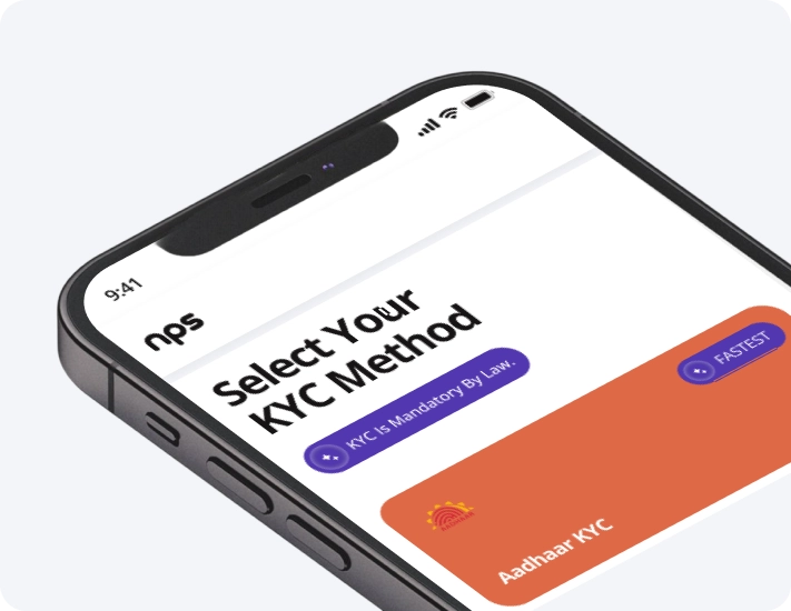
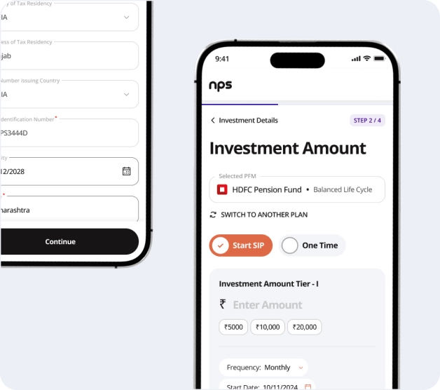
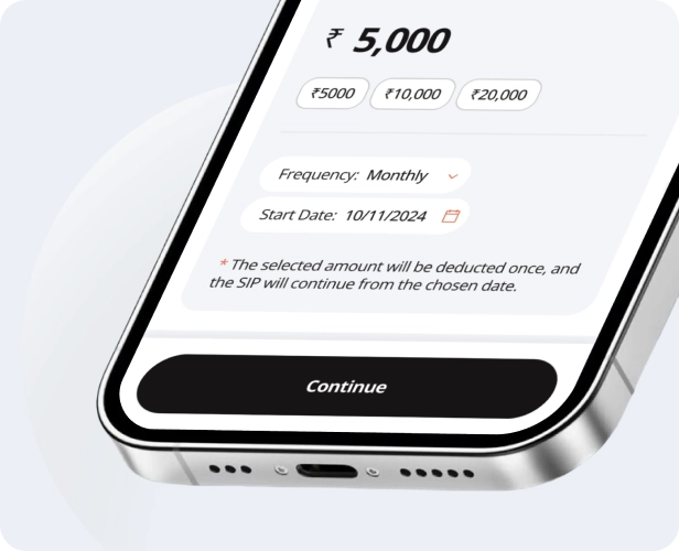
Mobile is not a desktop shrunk to fit. Every desktop branch is rebuilt as a card-based mobile flow, with the same labels and the same architecture
OTP-led path, single screen capture.
Choose allocation, then commit. Two taps
First-class management surface, post-onboarding.
07 Impact
Faster. Clearer. Honest.
Mobile is not a desktop shrunk to fit. Every desktop branch is rebuilt as a card-based mobile flow, with the same labels and the same architecture
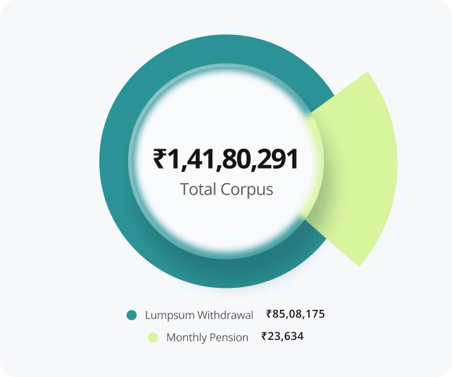
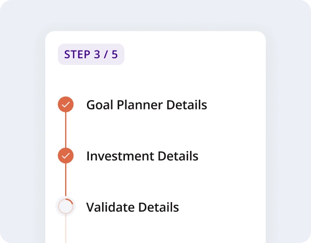
Time-to-PRAN, drop-off, and mobile lift are projected from PFRDA-regulated platform benchmarks. To be validated against post-launch analytics
08 Lessons
Five things this redesign taught us.
Mode selection is not a step. It is the architecture.
When users self-select their goal up front, every screen after it works harder. Decision-first IA outperforms field-first IA in every onboarding category we have tested
Compliance is not the enemy of UX.
PFRDA and KYC requirements did not change. The number of fields did not change much either. What changed was sequence, surfacing, and parallelism, all UX moves, none of them regulatory.
Mobile is not desktop minus pixels.
Designing the mobile flow as its own native branch tree, not a responsive shrink, recovered an audience the legacy product was quietly losing.
Show the cost of every path.
When the user knows a branch is 4 steps and 90 seconds, they commit. When they don't, they bail. Time-to-finish is the most under-used trust signal in fintech onboarding
Treat 'Edit' as onboarding's twin.
Subscribers who edit allocation in the first 30 days are 3× more likely to fund a second contribution. Surfacing Edit as a first-class path is a retention move disguised as an IA decision.