Digital Experience · Social Impact
Building a home for India’s revolution in child education.
A first-person account of how we re-imagined the website of a Jaipur-based NGO, not as a charity brochure, but as a movement people could join.
01 Overview
A digital experience for a movement, not just a charity.
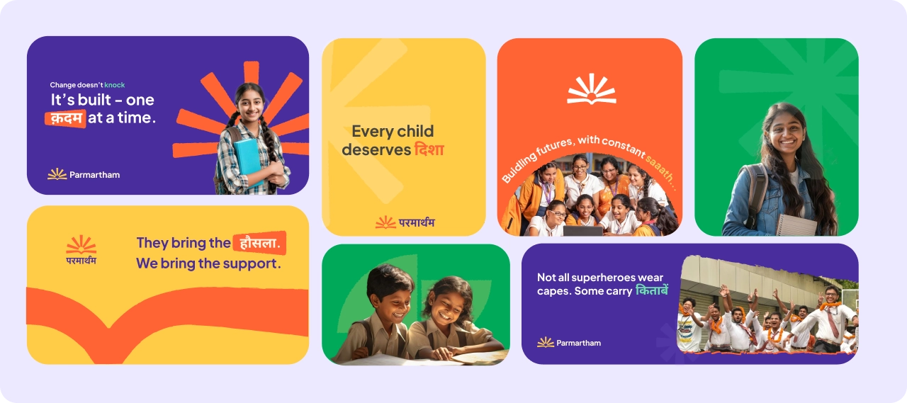
Parmartham is a Jaipur-based NGO redefining what education access can look like in India. Founded by Mr. Ankush Tambi, it works on the idea of SETU, a bridge through Skilling, Enabling, Transitioning, and Uplifting. Through programs like Saksham Bharat, Shiksha Shala, and Kaushal Vikas, it has helped 110+ scholars reach premier engineering colleges, with nearly 70% securing seats in IITs and NITs. Our brief was simple: design a website that reflects the scale and spirit of this movement.
02 The Challenge
We inherited a category problem before we inherited a client.
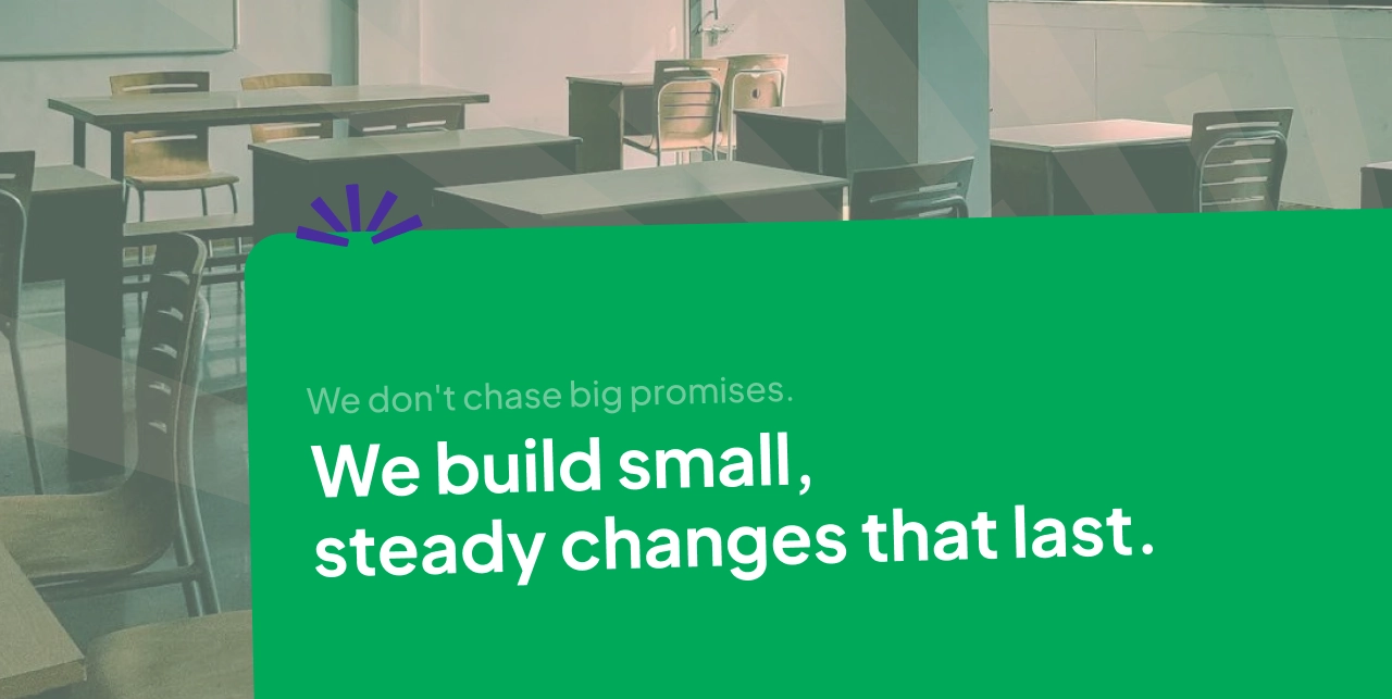
Where most Indian NGO websites mistake pity for persuasion, cluttered with washed-out imagery, urgent donation counters, and broken trust, Parmartham needed the opposite: a calm, dignified, classroom-like experience that solved for donor friction, volunteer invisibility, flattened beneficiary stories, mobile neglect, and information chaos all at once.
03 Logo and Graphics
A Symbol of Hope and Growth.
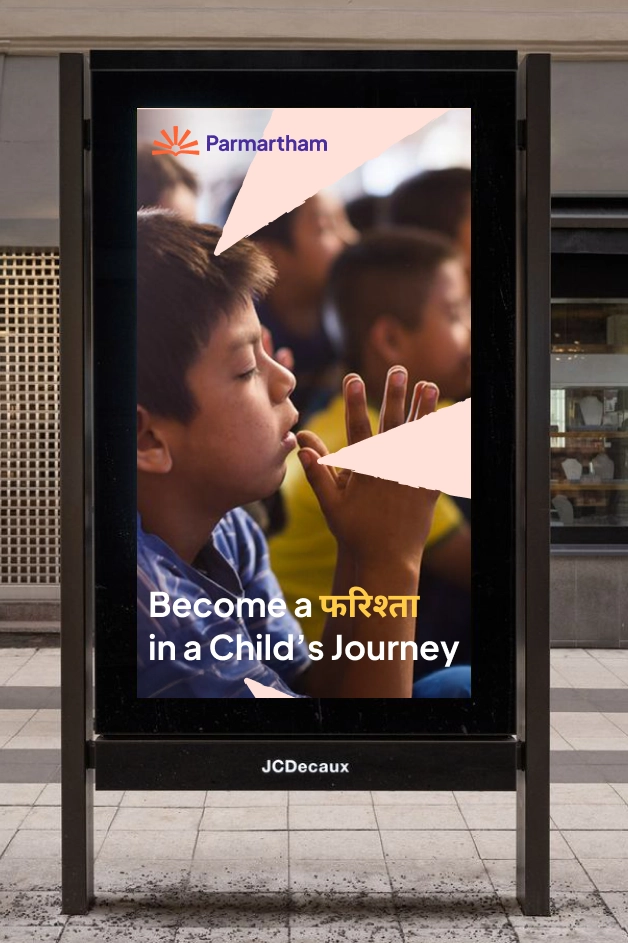
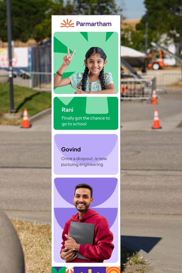
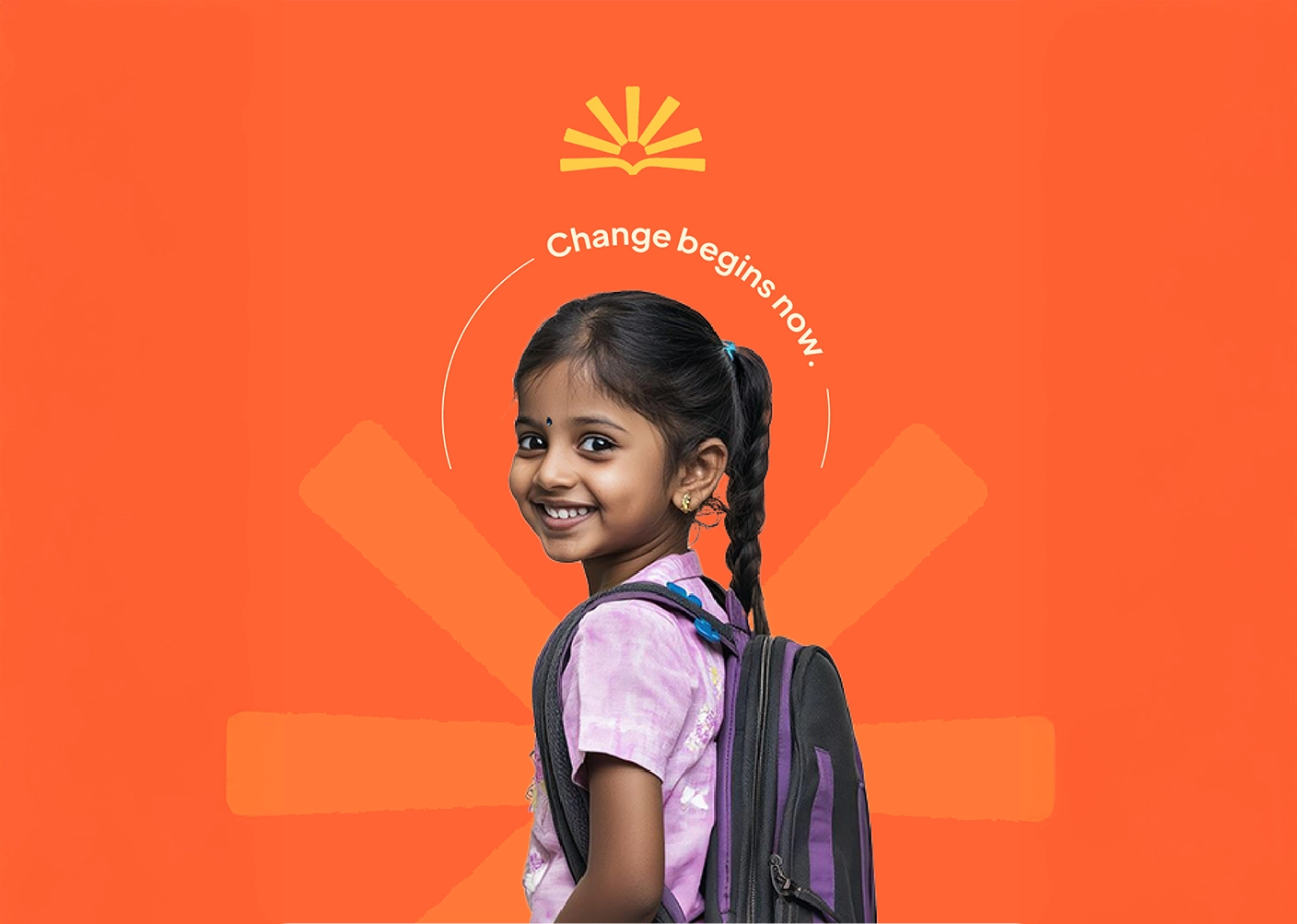
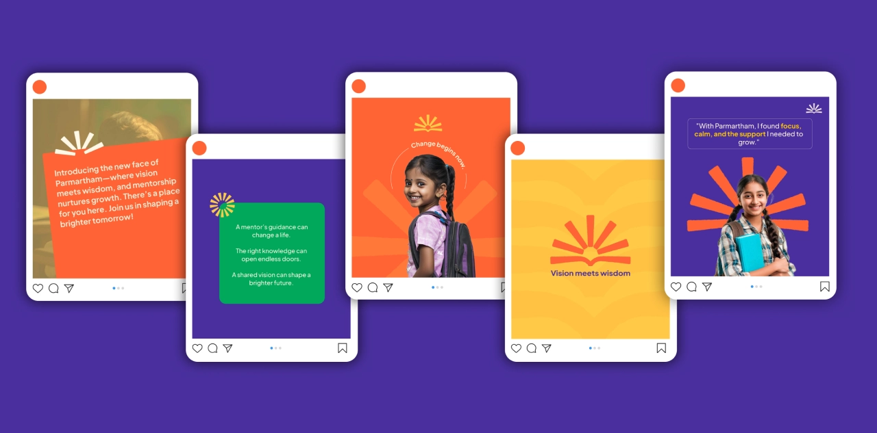
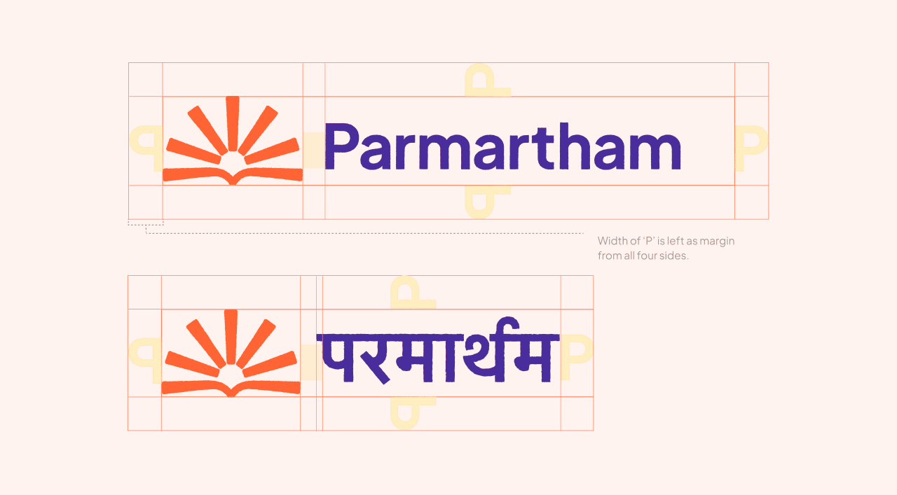
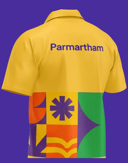
The Parmartham visual identity combines a meaningful logo system with bold graphics that reflect education, empowerment, and growth. The open book and rising sun symbolize knowledge, hope, and new beginnings for every child.
Bright colors, geometric forms, and expressive patterns create a youthful and optimistic visual language, bringing warmth, inclusivity, and consistency across all brand touchpoints.

04 UX Strategy
Designing Clarity, Trust & Impact.
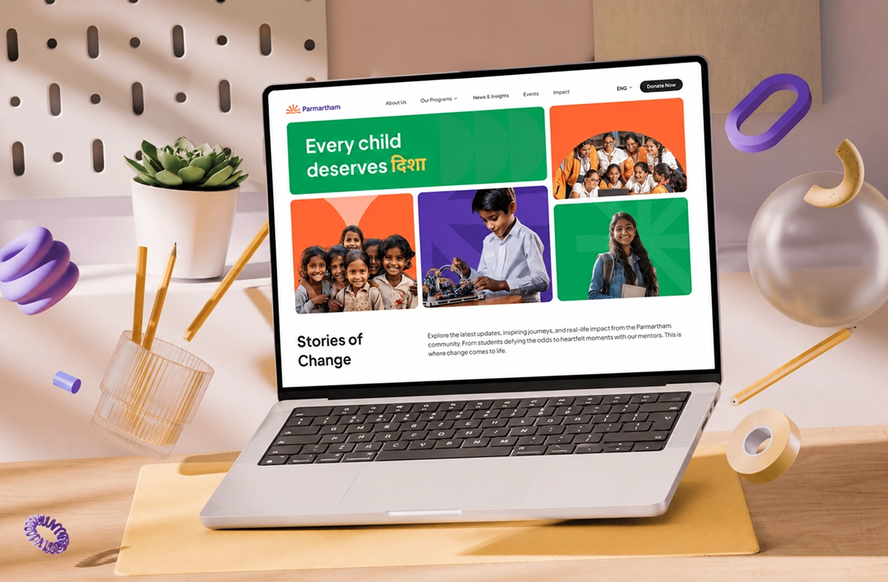
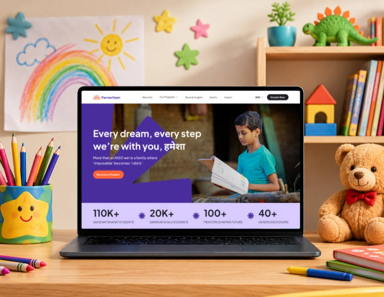
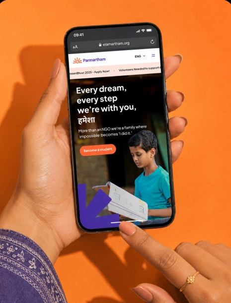
The UX strategy focuses on simplifying navigation, building trust through transparency, and presenting impact through meaningful storytelling. Every interaction is designed to help visitors feel informed, connected, and motivated to take action.
05 Information Architecture
Architecture is empathy made structural.
Eight pages, each earning its place. Home helps visitors find their path in seconds. About builds trust through leadership and story. Programs gives each initiative its own space. Impact pairs numbers with human stories. Events shows the work is alive. Volunteer becomes a real destination, not a footer link. Donate is one frictionless flow. Contact puts a human voice behind two real offices.
06 Visual Design System
An Indian visual language without a single cliché.
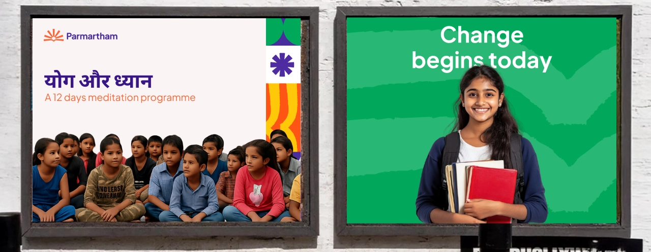
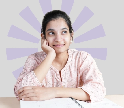
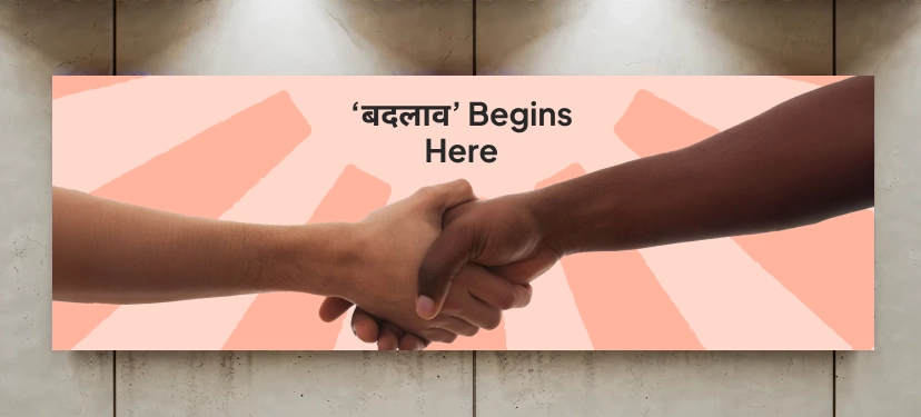
Bold typography, vibrant colours, and geometric forms create a warm, optimistic identity. The palette reflects growth, hope, and inclusivity, while recurring patterns build brand recognition. Authentic imagery and clean layouts highlight real stories of education and transformation, creating an emotionally connected experience across every touchpoint.