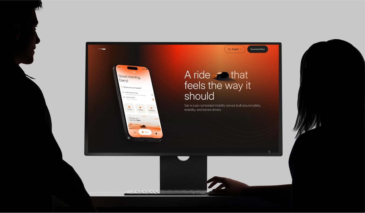
Brand Identity & Experience Design
Not Just Another Cab Hailing App
Redefining luxury mobility through thoughtful branding, emotionally intelligent UX, and a seamless digital experience designed around trust, comfort, and clarity.
01 Overview
Built For Journeys You Can Rely On.
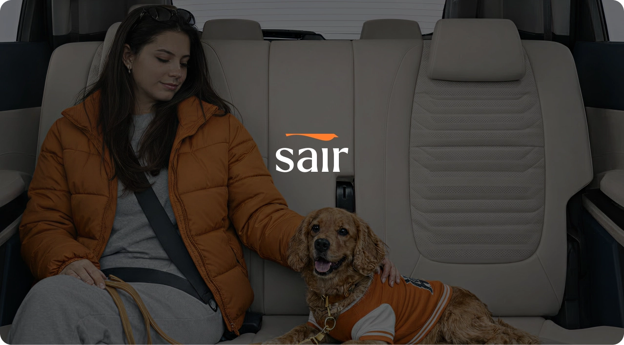
Sair is a premium mobility platform built around a single belief: that travel should feel like someone is genuinely looking out for you.
We built Sair from the ground up: brand identity, product strategy, 500+ UI screens, and a design system with 280+ components. We weren't designing screens. We were designing trust.
02 The Challenge
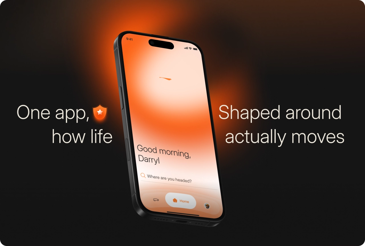
The challenge was to design a mobility experience that felt premium without losing emotional warmth.
Luxury mobility products often lean heavily toward either sophistication or usability, rarely both. The challenge was to create a brand and product experience that felt visually refined, emotionally reassuring, and effortlessly intuitive across every touchpoint.
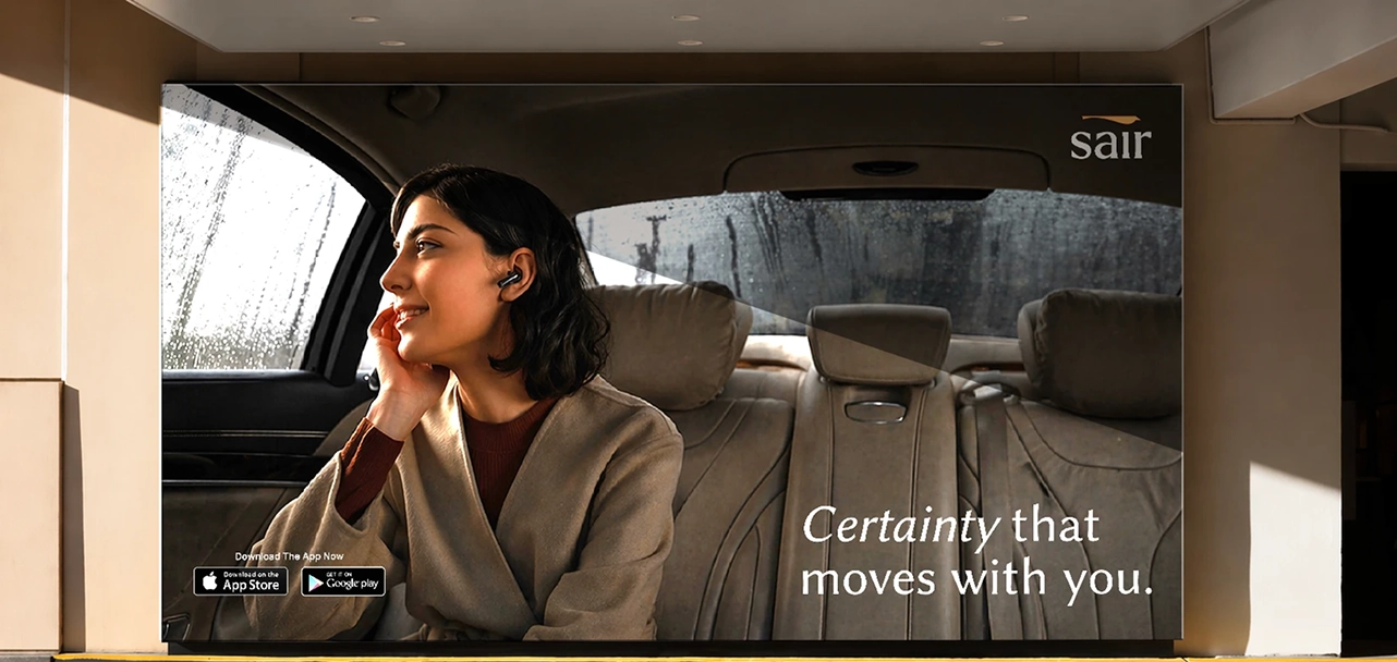
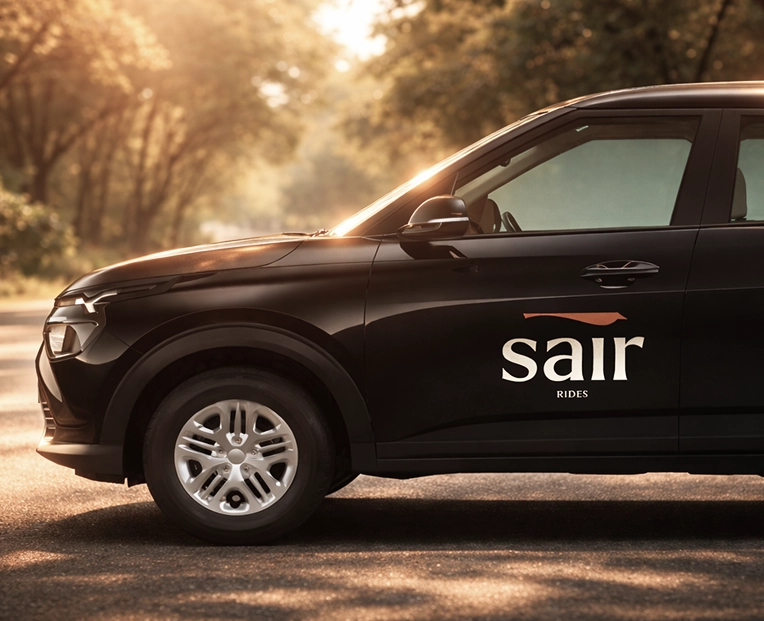
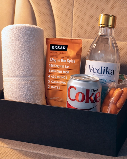
03 Logo and Graphics
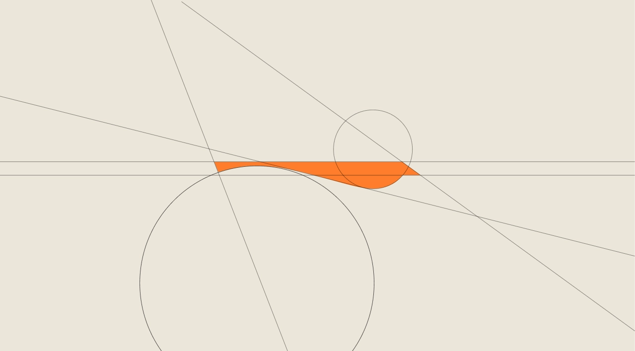
A Mark Designed For Calm Movement
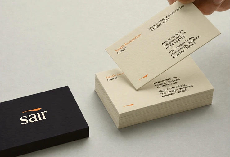
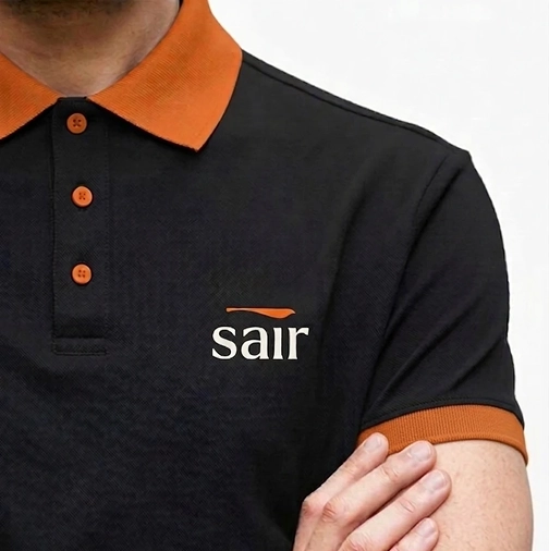
The bird in Sair’s logo draws inspiration from the feeling of a gentle breeze and the clarity of a seamless journey. The bird in flight represents lightness, continuity, and effortless movement symbolizing travel without hesitation, anxiety, or uncertainty.
04 UX Strategy
Designing Around Real Human Journeys
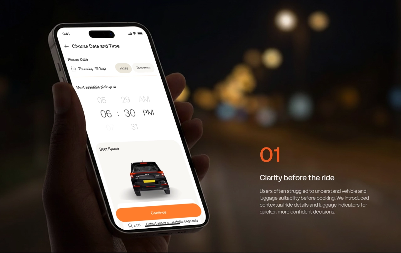
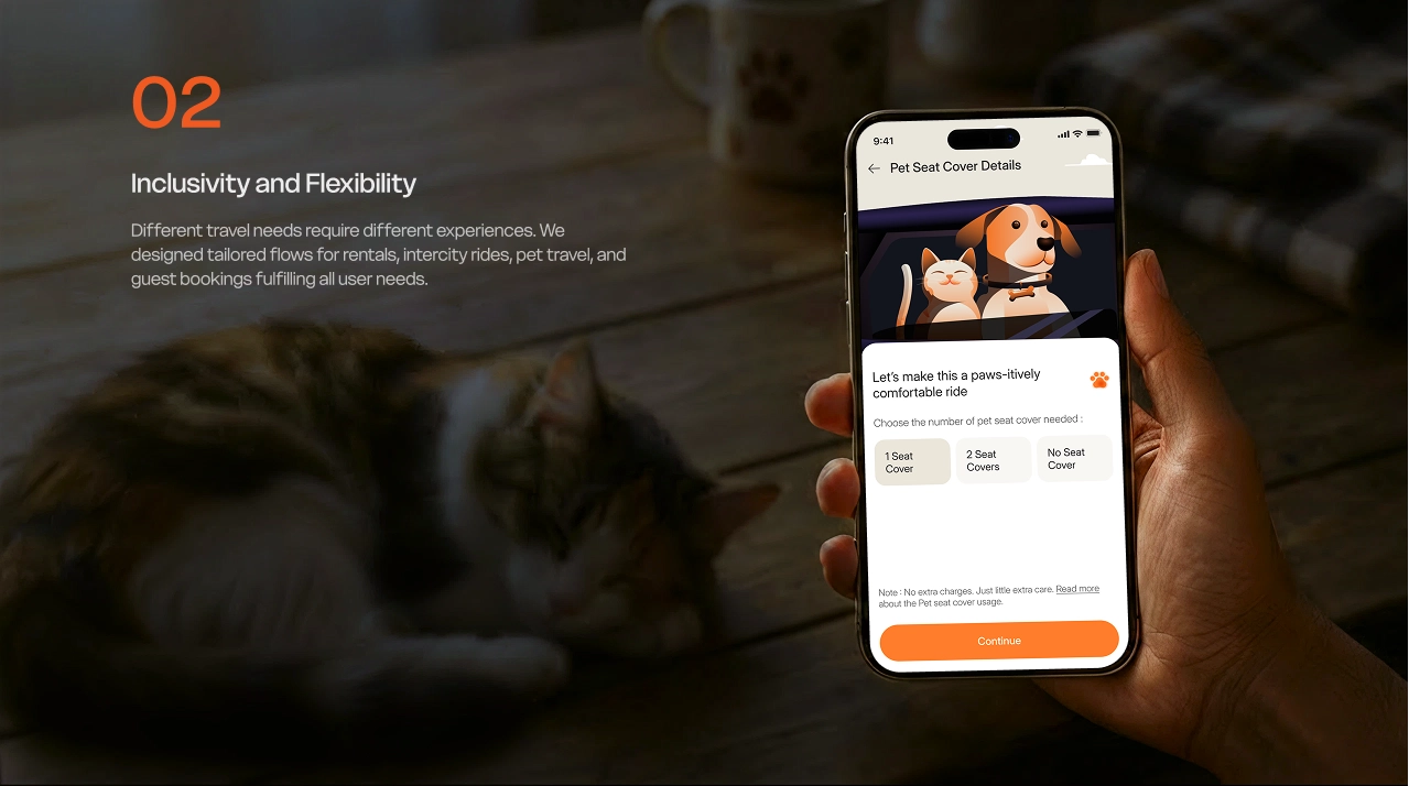
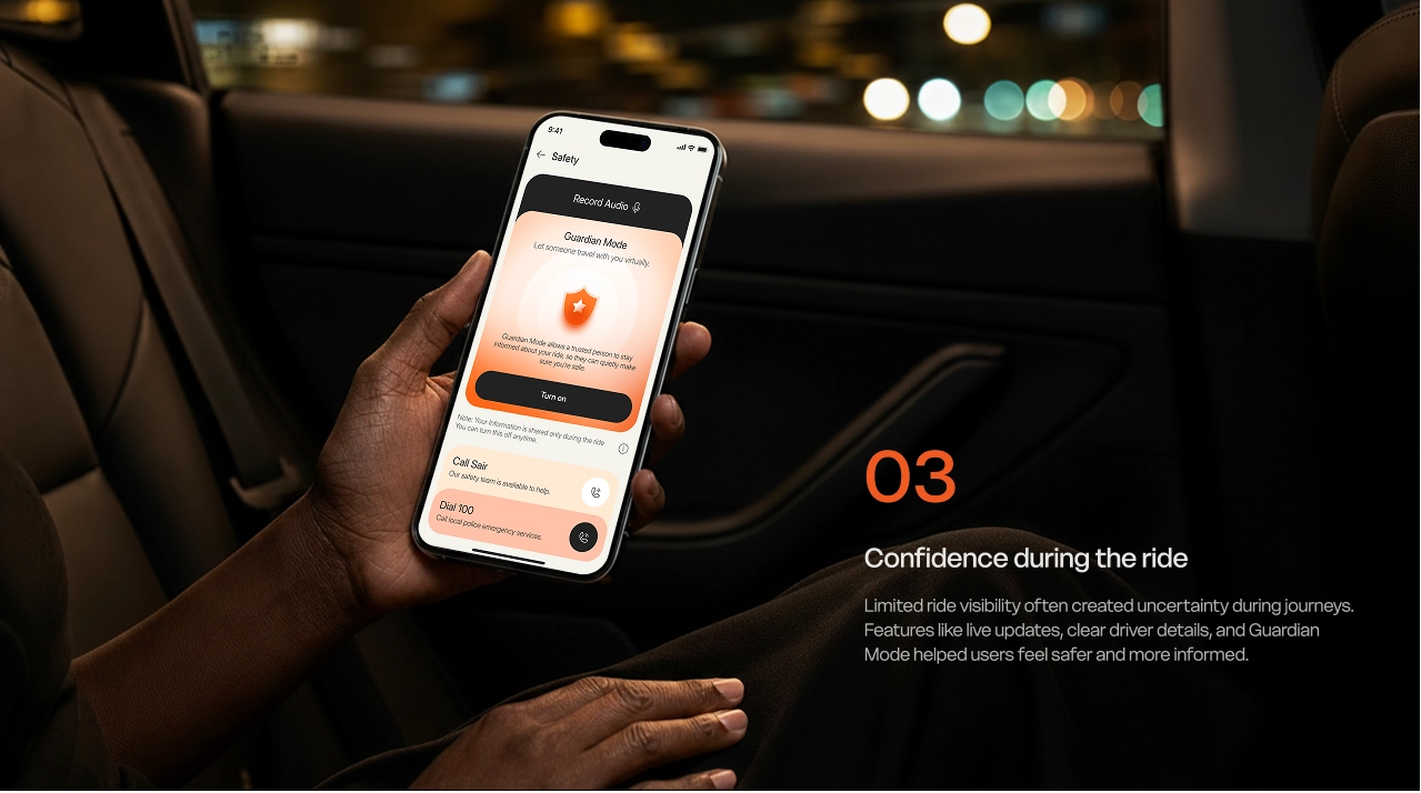
The UX process focused on simplifying complex mobility experiences while making every interaction feel calm, intuitive, and reassuring. From rentals and intercity rides, every flow was designed to proactively reduce uncertainty through clarity, transparency, and human-centered interactions. Sair’s UX strategy centered around three fundamental user needs:
05 Design System
Designing Consistency At Scale
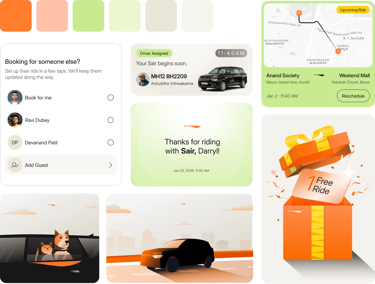
We built an extensive design system with 280+ components, adaptive patterns, semantic foundations, and scalable interaction principles, creating a seamless and consistent experience across every Sair touchpoint.
06 Brand Language
Calm. Warm. Reassuring.
Sair’s communication system was designed to sound human, not robotic. Every notification, CTA, helper text, and ride update was intentionally written to feel supportive, clear, and emotionally aware.
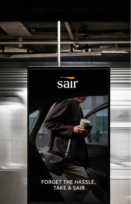
07 Final Result
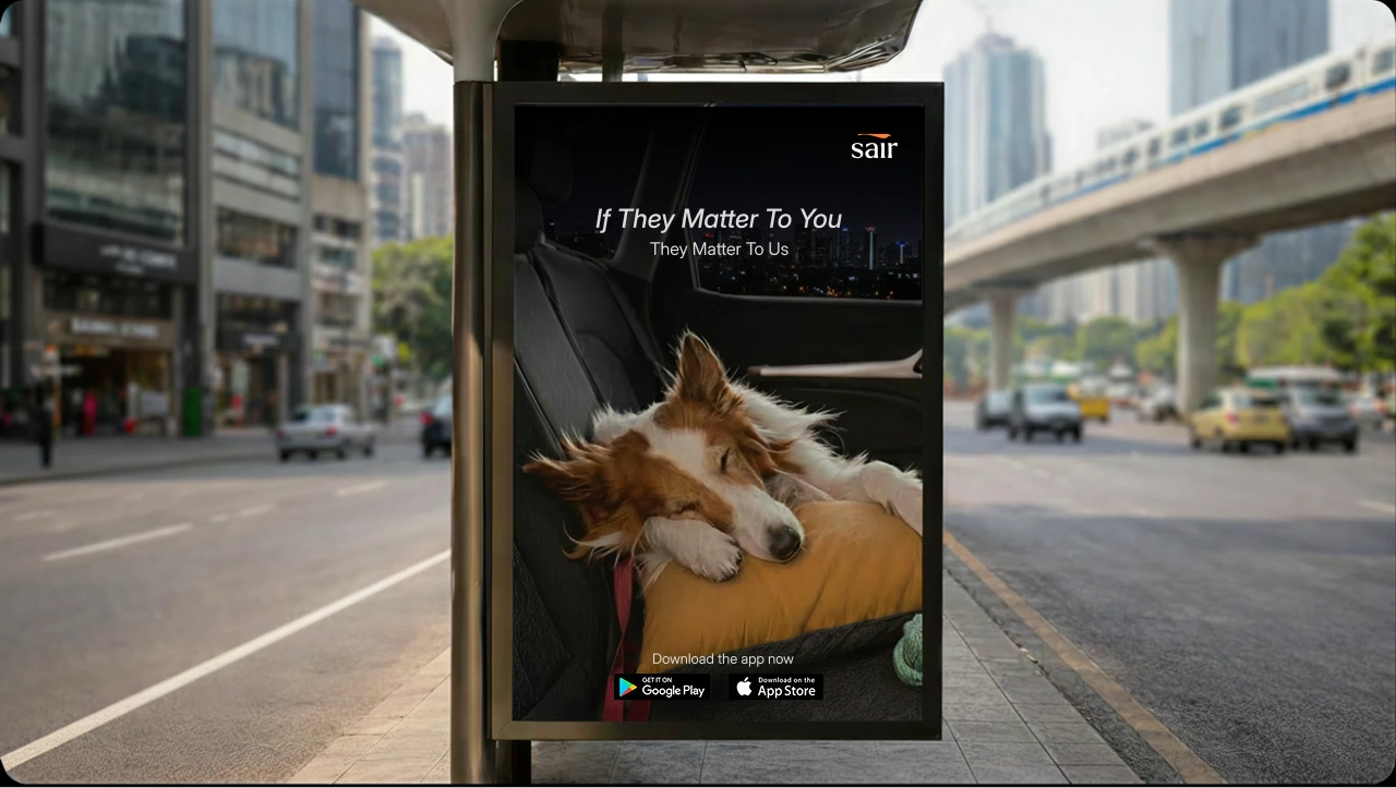
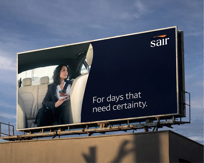
A platform that feels less like an app, more like a promise.
Brand built from zero
A complete identity - wordmark, color system, type scale, and brand voice designed to hold its own alongside the world's best mobility brands.
A design system that scales
280+ components, 6 token categories, full dual-theme coverage documented and built to grow with the product without breaking a single pattern.
UX that reduces real anxiety
Every feature addresses a documented real-world pain point. Not assumptions, observed human behavior, turned into calm design decisions.
A voice people remember
Microcopy that makes users feel cared for. Language that sounds like a trusted companion, not a system process.
Three ride types, one world
Rental, intercity, and everyday rides, each complex, each distinct, unified under one coherent design language.
Role-based human experiences
Distinct flows for riders, guests, and guardians, each tailored to what that person actually needs to feel safe and in control.